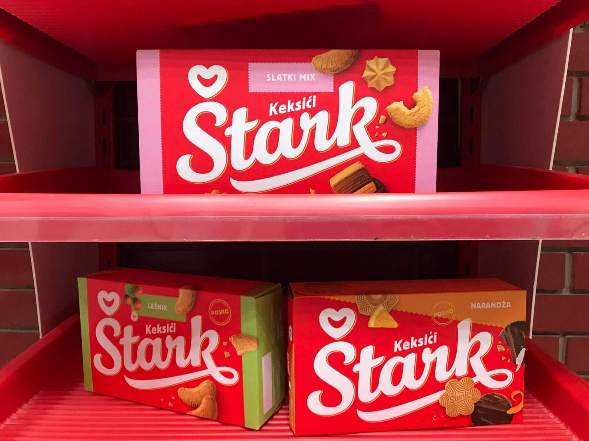
Stark presents NEW LOGO ON THE occasion of 100th anniversary (PHOTO)
Exactly 100 years ago, the most famous local chocolate factory, Stark, started producing sweet surprises, and on this occasion a new visual identity was presented. The well-known company logo will look different from today.
The Atlantic Stark Company was founded in 1922, and today it celebrates a century of existence, together with media representatives in Ljubovija, which houses the production plant, which is the second largest plant that this company has. More than 100 people are employed in Ljubovija, and this production plant produces biscuits.
Net income of the company is 91 million euros, and in their portfolio they have 6 brands: Smoki, Najlepse zelje, Krem bananice, Prima, Biscuits and Waffles, Menaz.
Stark’s key values, according to the company, are love, trust, contemporaneity, care.
For the last year, the company has been working on a new logo and symbol, the improvement of biscuits and waffles, new communication and new products, a new visual identity of the company’s stores, but also a website that has now been redesigned.
“The new logo highlights the best elements of the old and welcomes the future with a smile. The focus is now on Stark, as a brand,“ the company said.
Namely, products with a new logo are already on sale.
Izvor: BIZLife
Foto: BIZLife


